Developing an Energy Saving App
After receiving our Energy Consumption brief we decided to develop a wifi-based central control hub for household energy usage. The app will control usage of the devices through previously installed monitoring devices attached to the appliances and will be able to turn them on and off from a remote location. The app will also be able to monitor household energy usage, paying specific attention to electricity and gas usage.
At their heart, all energy conservation apps are about one thing, saving the users money. Easing global warming and saving the polar ice caps is a nice addition but everyones priority is the conservation of their own bank balance. After a brief look at other energy conscious technology, such as solar panels or wind farms, there seems to be an initial economic investment that then starts to slowly reward the investor - these devices are very much designed to be used for the long run, not a one week fad.
 As well as saving money, eventually, they also reduce usage. This is the second factor we must address in the design of our app. The ability to turn off devices such as showers, heating and electrical outlets, from remote locations will save energy, time and money for the user and the ability to do this all from one central hub will dramatically increase the savings.
So our app is aimed at an affluent but money conscious demographic, and with the initial installation of the monitoring devices that the app controls it might be wise to aim the app at property developers that install the devices when constructing or renovating buildings.
As you can see from this example of an existing app wifiplug, that controls energy flow to a previously installed electrical outlet plug, most existing designs are skeumorphic and in turn, look dated within the confines of new operating systems like iOS7 and Windows phone. Our design shall be a flat, clean aesthetic that is easy to navigate and function. It shall also work as a central hub that allows the user controls over many devices in one place.


 Our primary focus with the Ube app is that is be simple, intuitive and not get in the way of controlling your lights. That’s why we created a whole new way to interact with the app. We take full advantage of the touchscreen nature of smart phones to make our app gesture based. Slide your thumb up to raise the lights and down to lower the lights.


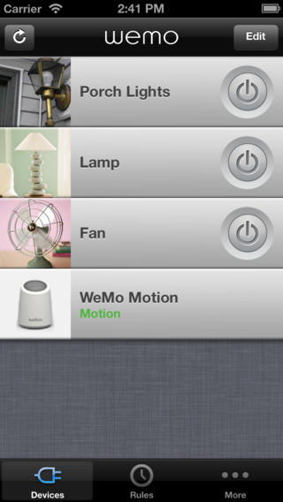 The grey and white colour scheme does allow the odd splash of green to pop form out of the screen, green is an important colour choice based on the environmental nature of the app ( it is also the colour of money in the US of course) However I feel that the choice of grey with this skeumorphic approach only darkens the navigation bar and the interface feels quite claustrophobic.
 I appreciate the icon design within WeMo. The icons for the clock are very easily recognisable and suitably minimalist in approach. The email or SMS icon is also very similar to that of the iOS mail app and therefore fits in well to the operating system's motifs. As i previously mentioned, the green is a good and important touch, there is also an added visual gratification in the applied gradient to the green, giving the colour shape and form. However, the skeumorphic design has also encroached upon this area as the icons have been embellished with drop shadows. I understand the principal of making the icons look more like real buttons by adding depth to the design but I feel it is an unnecessary cluttering of the interface. But perhaps thats just my Bauhaus-ian palette kicking in.

 "Also called phantom energy, phantom load, standby power, idle current and vampire power, phantom power is the energy used by appliances and electronics when they are turned off but still plugged in to a power outlet [source: Energy Star]. According to the Lawrence Berkeley National Laboratory (LBL), the average home contains 40 products constantly drawing power. Individually, the electricity flowing to a TV that's been turned off or a coffeemaker programmed to brew in the morning is extremely small, but together, these sleeping devices may account for as much as 10 percent of household energy use [source: Lawrence Berkeley National Laboratory]."
 As well as saving money, eventually, they also reduce usage. This is the second factor we must address in the design of our app. The ability to turn off devices such as showers, heating and electrical outlets, from remote locations will save energy, time and money for the user and the ability to do this all from one central hub will dramatically increase the savings.