 |
| Final Mockup of the Malmo House iPad Publication |
Friday, 13 December 2013
Further iPad Layout
After getting the previous two slides to a place where I was happy with them, I continued to develop the Portfolio page, meet the team page and contact us page.
 Firstly, I decided to create the Portfolio or What We Do page, here I selected the companies most successful videos to date to make sure I was showcasing the companies best work. I continued the circular theme by adding circular text boxes and circular scrollable frames that allow the viewer to read a short description of the video that they are related to. I spent some time resizing and reshaping the circles - I found it tricky to get an appropriate amount of padding between the elements. I'd say this page took the most experimentation until I had a full content rich page. Upon discussion with my tutor, I created a tab-style banner button that re-directs the viewer to Malmo House's online portfolio where they can see even more examples of the companies work. Using the hyperlink folio overlay, I chose to enable this, and the banners to follow to open on the device's browser rather than in folio. I chose this option because the connection time was a lot quicker using the browser and folio didn't process the companies website as successfully as the browser did. I am aware, however that navigating away from the magazine isn't always desirable and can result in loss of audience so I made sure that the publication asked permission before leaving to open the device browser.
 The next page I created was the Meet the Team page. This was an important addition as it offers context to the audience about the two people behind the company. I wrote a brief biography about the pairs interest in media, their education and experience, and how they came to found Malmo House. I appreciated that there was quite a lot of text on screen so I formatted it into two neat columns, and centered the text because I felt this created better balance within the page's overall design. To break up the text and add a little bit of professionalism I created two picture galleries, again within the familiar circular shape. The content of the slideshows consist of images of the two founders as well as screen shots and photography projects the company has produced. After creating the galleries I noticed that it wasn't immediately obvious that the viewer can slide between the images. To remedy this I designed two iOS7 inspired arrows that hopefully inform the viewer that they can access more content by interacting with the galleries. This page is also the first display of the social icons i had created to match the publication's theme. I chose to include personal networking hyperlinks as the publication will serve as a CV as well as a portfolio so it was important that the viewer can connect with and access more information from the team.
 The final page that I designed was the Contact Us page. As I mentioned before it is important to give the viewer the option to connect with the company as much as possible, for this I created the social icons within the companies circular style. I did this by finding vector graphics of the social icons in the form of the font Socialico, and placed them within a circle in the same dark grey as the companies logo. I also added the same tab I previously added to the portfolio and hyperlinked it to the websites contact us page. On this page I have created a html form where the viewer can email the company all contained within the website. I thought including this to the digital publication was a good idea as it also gave the viewer the chance to contact the company through email, if that was there preferred contact method. Finally I created another tab which hyperlinks to the URL of this blog, so that they can learn how it was created.
Initial iPad Layout
I had a rough idea of how I wanted the iPad magazine to be structures. I wanted to mirror the website I have designed previously for Malmo House.
 I knew that I wanted the first thing the viewer saw was the new logo, so I decided to use the image sequence overlay to add interactivity to the animated version of the logo, beneath this I was going to add buttons that direct the viewer to the desired pages. Here is the final design, I had to spend a lot time resizing the image sequence as when clicked it often skewed and distorted. However, it still decides to turn a darker shade of grey when selected, i couldn't seem to be able to remedy this in any way, which is a shame. I'm happy with the overall design, the colour scheme is consistent to the branding of the company and the fonts are the institutional fonts, Enriqueta and Open Sans, that the company uses in it's publications.
The next page I created was the Who We Are page. This is where I decided to house the channel trailer I had previously designed. I felt that this was an appropriate way of introducing the video as it should be the first thing the viewer sees past the cover.
 I spent a little time working out how to select a poster frame rather than leaving the video blank until play was hit. I was much happier with the poster as it made a neater, cleaner page layout possible. Beneath the video I chose to add some scrolling text. The text is lifted from the About page on Malmo House's website, I feel that adding this text not only demonstrated my skills to create scrollable frames but also was a valid addition to the page, creating information for the reader that they can interact with and welcomes them to the publication. I decided to add a few still images to contrast the video. The first image is a still frame from the character's mic animation, i felt this helped to ground the video within the text by creating a recurring theme that ran through both the video as well as the digital publication. The other images are from Malmo House's Instagram and Facebook pages. Connectivity is important so I felt it was important to converge the website content and magazine. I placed the images within a circular frame, so to continue the circle motif that is currently running through the website and logo layout.
Thursday, 12 December 2013
Creating the Promotional Video
I was very glad to receive the task of creating a short promotional film for the iPad magazine project. I had been meaning to make a similar thing to use as a Youtube trailer and I was glad to be able to finally create my idea.
I decided to demonstrate my 2D compositing skills by re-animating the short animated gifs I have on the website. The gifs consist of two simple characters that resemble the flat logo design, these characters are meant to symbolise the two members of Malmo House.

I had to re-animate the characters because the GIFs were too low in resolution. I also took this opportunity to redesign the characters. There isn't much of a physical difference, but I used groups and smart layers to make the characters much easier to animate. I also created a blink preset, so that all the blinking was identical, this helped to create a motif throughout the two characters.
 The first sequence I planned and animated was the business card sequence. I masked off the top card and added it to a new layer, this was so I could place the characters behind them and make it appear that they are peering out from in between the cards. I chose not to use the arms in this sequence so i could emphasise the eyes and hopefully add some emotion to the characters through their eye movement, much like the Gromit character in Nick Park's Wallace & Gromit.
The second sequence I animated was the waving on the laptop. This turned out to be my trickiest edit. I shot the footage of the laptop with the intention of reversing the footage in the edit. I chose to do this as the tilt I was using in the film seemed more natural the opposite way to how I had planned the animation. In retrospect, it would have been far easier to reverse the footage before tracking and animating, but I went into the edit expecting to reverse afterwards. This made it more difficult to track, and it took many attempts to get right, sometimes the null wouldnt respond the way i wanted it to so some additional keyframing was needed. After I tracked the footage and the null was behaving how I wanted it to, I simply parented the animation composition to the null and it sat nicely within the final composition.
 After, this I animated the camera sequence, this in itself lead to a few problems, the camera was not as shaky as I wanted it to be, I was trying to present a handheld feel whilst using a stabiliser, this footage wasn't shaky enough so I ran it through a destabiliser plug in for after effects and added some motion keyframes. When I was happy with the outcome I motion tracked which was a lot easier this time around. When animating the figures I chose to use easy ease for the actor's arm as he holds up the skull and for the cameraman's arm as he followed the movement. This created a more fluid and natural movement and allowed me to add a little bit of expression in the characters.
 Finally I animated the microphone sequence. This added a new challenge as I wanted the characters to sit upon the interface box, this required me to track on a different plane, after a few goes I managed to select the correct plane and tracked successfully. So after i added the animation composition to the tracked plane, exported all the sequences, assembled them in Premiere, reversed the laptop shot and added the animated logo. This completed my animation, 2D composition and motion tracking demonstration in the channel trailer for Malmo House.
I decided to demonstrate my 2D compositing skills by re-animating the short animated gifs I have on the website. The gifs consist of two simple characters that resemble the flat logo design, these characters are meant to symbolise the two members of Malmo House.
I had to re-animate the characters because the GIFs were too low in resolution. I also took this opportunity to redesign the characters. There isn't much of a physical difference, but I used groups and smart layers to make the characters much easier to animate. I also created a blink preset, so that all the blinking was identical, this helped to create a motif throughout the two characters.
The first sequence I planned and animated was the business card sequence. I masked off the top card and added it to a new layer, this was so I could place the characters behind them and make it appear that they are peering out from in between the cards. I chose not to use the arms in this sequence so i could emphasise the eyes and hopefully add some emotion to the characters through their eye movement, much like the Gromit character in Nick Park's Wallace & Gromit. The second sequence I animated was the waving on the laptop. This turned out to be my trickiest edit. I shot the footage of the laptop with the intention of reversing the footage in the edit. I chose to do this as the tilt I was using in the film seemed more natural the opposite way to how I had planned the animation. In retrospect, it would have been far easier to reverse the footage before tracking and animating, but I went into the edit expecting to reverse afterwards. This made it more difficult to track, and it took many attempts to get right, sometimes the null wouldnt respond the way i wanted it to so some additional keyframing was needed. After I tracked the footage and the null was behaving how I wanted it to, I simply parented the animation composition to the null and it sat nicely within the final composition.
 After, this I animated the camera sequence, this in itself lead to a few problems, the camera was not as shaky as I wanted it to be, I was trying to present a handheld feel whilst using a stabiliser, this footage wasn't shaky enough so I ran it through a destabiliser plug in for after effects and added some motion keyframes. When I was happy with the outcome I motion tracked which was a lot easier this time around. When animating the figures I chose to use easy ease for the actor's arm as he holds up the skull and for the cameraman's arm as he followed the movement. This created a more fluid and natural movement and allowed me to add a little bit of expression in the characters.Finally I animated the microphone sequence. This added a new challenge as I wanted the characters to sit upon the interface box, this required me to track on a different plane, after a few goes I managed to select the correct plane and tracked successfully. So after i added the animation composition to the tracked plane, exported all the sequences, assembled them in Premiere, reversed the laptop shot and added the animated logo. This completed my animation, 2D composition and motion tracking demonstration in the channel trailer for Malmo House.
Creating an Animated Logo
After designing the improved flat design logo, I decided it would be a good addition and demonstration of my 2D compositing skills to animate the new logo.
Firstly i had the idea of summarising what the company does in the animation. We chose to suffix our name with "house" to resemble the name of a production house or design house so I chose to manipulate this. I located the three areas or media that the company is trying to specialise in;

Firstly i had the idea of summarising what the company does in the animation. We chose to suffix our name with "house" to resemble the name of a production house or design house so I chose to manipulate this. I located the three areas or media that the company is trying to specialise in;
- Picture - This will be every image work that the company produces whether that be stills, photos or video. I chose to use this first for two reasons - the company currently has mainly short films on their online portfolio - the second reason was to allow the audience to make the connection to the picture house motif
- Sound - Although i'm not sure that a "Sound House" is in existence, I thought it was an appropriate element as the company focuses on music video and often do their own recordings and live lounges - it is an important discipline for Malmo House
- Design - Finally design was chosen as the company understand the importance of good design. I chose to put design last as - because it is such a vague discipline and can be applied to both sound design and picture design. The company does do some design work - but their sound design and picture design take priority.
I chose to use After Effects to animate the logo. I kept the animation simple as to not overcomplicate the flat design of the newly renovated logo. I found it was more aesthetically pleasing to have the animation slide right to left. Even though this is the opposite way that English is read, it helped to balance the logo better and perhaps even was more of a surprise to the audience. By using easy ease keyframes I was able to add an "overkill" effect almost making the words look like they skid into place. I felt this was a more organic movement and again added aesthetically to the design.
Finally, when I was happy with the movement of the exits and entrances of the words I repeated the "*MALMO" layer to round the animation off. I thought this would be useful if the logo was ever used in a loop situation or for gifs etc.
My last stage was to export the animation not only as the finished ident movie file but also as a sequence of JPEGs. I did this so that, in Indesign, I was able to created a sequential image interaction with the logo - the user can now run their finger across the logo and control the animation - I thought this interactivity would help raise the production standards of the iPad publication.

Thursday, 5 December 2013
Logo and Element Design

This is the existing Malmo House logo. It is in low resolution but depicts a house in a chalk like texture.
I designed this logo because I am influenced by Swedish design, hence the name Malmo House. I designed this logo after being inspired by the designs of Simogo for the Swedish iOS game Year Walk.
The game is a rich, aesthetic-led designed game that uses sketchy techniques to create a dark and wintery tone. I adopted this when developing the Malmo House original logo, but after my design was created and used in thumbnails on Youtube, Facebook and Twitter I noticed that it was a complicated logo to read and often degraded in resolution. I felt it was important to retain the name of Malmo House in the logo as we are a new-build company and the most important thing for us at the moment is getting our name out into the competitive marketplace.
 |
| House design within Year Walk, the blacks, whites and grey colours that I adopted were directly influenced by Year Walk's colour scheme. |
 |
| Character design within Year Walk. I adopted the textures and gradients used in this image for the Malmo House original logo. |
It was after this discovery that I again turned to Year Walk. Simogo create iOS and mobile platform interactive media, so they must come across thumbnails in their product development. The logo design for Year Walk is a lot more minimalist, clear and flat than the design of the game - this was an important step to make sure it looked professional on the small thumbnail of an iOS icon. I also looked at the very minimalist approach of Simogo's own logo - this time incorporating text into a loosely based circle element. I feel circles are very fashionable at the moment, being a simple shape and effective device in contemporary flat design.
 |
| The logos for Simogo and Year Walk. |
So after researching existing logos I created this first draft of a flat design Malmo House logo.

I liked the circle and right aligned text, I chose the font Open Sans as it is a clear and sans serif text so will look better when scaled down. I also adopted Simogo's black and white colour scheme, however I chose a dark grey instead of a black as it went well with the sand colour that Malmo House use. In this development, the two layers of text are the same pixel size, I think it makes the logo look disjointed and lopsided so, with the next alteration I decided to exploit more of the empty space within the circle.

By making the "House" layer larger I feel the logo looks more balanced and the right amount of space is created and used within the circle. I chose to include the asterisk to add a small amount of aesthetic within the logo, hopefully this can also develop into a motif, allowing us to simplify the logo even further.
Initial Interface Development.
Malmo House already has a few set colour variations that can be called a colour scheme. The below board shows the three colours, as well as pure white, that we use in our publications and idents.


 |
| The colours were chosen to add warmth to the companies productions. |
I have created these font boards to show the two fonts that the company uses within it's brand identity. Enrequita and Open Sans are both web-friendly fonts, allowing easy convergence amongst browsers and devices.


Convergence Task
For my convergence task I will be creating an interactive portfolio for the production company I set up. Malmo House. We already have a small web presence, Youtube channel and Facebook/ Twitter accounts. We have started a brand identity but I shall develop this further, creating logos, character animations, colour schemes and corporate font boards.
It is important that our logo is simple, clear and easy to transfer from computer screens to mobile and tablet screens. I shall design all of these elements with convergence in mind. I shall wrap all my design boards together and create a digital portfolio in the iPad format.
I shall use 2D compositing techniques to create a channel trailer for our Youtube page that illustrates both the character animations that will be associated with Malmo House as well as the development of my skills in tracking and set extension as well as keyframe animations.
Wednesday, 27 November 2013


Tuesday, 26 November 2013
iPhone Mockups
 |
| Mockup to show the Circuit logo within iOS7. |
The iOS icon is an important context as we have initially chosen to display our app on the iPhone platform.
Below is a mockup of our logo as a splash screen as a user loads our app in location

Circuit and Logo Ideas

When we developed the logo we chose to keep an electrical theme and adopted an electrical diagram approach. We thought this would reflect the simplicity and ease of use that we aim to design our app to have. We chose the name circuit because it is a homonym for electricity, playing well for the energy efficient side of our app, and connectivity - again reflecting the network aspect of our app.
Competition & Inspiration Overview
I had a few ideas that I wanted to contribute to the design of our wifi controlled energy app, but its important to consider the design elements of any existing solutions so I can compare aesthetics and also make sure the design of our app is better, in our opinion.
 Our primary focus with the Ube app is that is be simple, intuitive and not get in the way of controlling your lights. That’s why we created a whole new way to interact with the app. We take full advantage of the touchscreen nature of smart phones to make our app gesture based. Slide your thumb up to raise the lights and down to lower the lights.
The skeumorphic design of the sliders and controls is confusing and boring to look at. It seems quite labour-intensive to set up, I feel like this would be less of a chore with a more friendly user interface.
The design off the whole app really lets the concept down. In this over-cluttered window users can switch between which scene they want to control and then dim the lights with the slider. I dont like this design of the buttons - it is blocky and overcomplicated and takes up more screen space than is needed. I imagine they are easy to use as they will have a large selective area, perhaps this was the company's main priority instead of the visual aesthetic of the app.
ube: Control your Lights from your Smartphone.
ube is a central app that controls lights, plug sockets and dimmer switches. ube also produce electrical components like the dimmer switched and plug sockets to use with the app.
 Our primary focus with the Ube app is that is be simple, intuitive and not get in the way of controlling your lights. That’s why we created a whole new way to interact with the app. We take full advantage of the touchscreen nature of smart phones to make our app gesture based. Slide your thumb up to raise the lights and down to lower the lights.
Considering ube's mission statement to make the user interface simple and intuitive, as well as their clean crisply designed website and branding - the ACTUAL UI is quite convoluted and crowded.
 |
| This is the Scene configuration window. Users use this to set up rooms or scenes. |
 |
| This is the Energy Reporting window, here ube displays economic information to the user. |
This window concept is something that could be useful for our app. The bar graph is a good way of showing the savings that the ube interfaces help make. ube also sends reminders and notifications to users when energy consumption rises substantially - this is a useful way
of communicating data to the user.
 |
| This is the main control window. Users can dim or brighten lights and select which light to use. |
Wednesday, 20 November 2013
WeMo Case Study
This post is a study into the design of an already existing app, WeMo. WeMo allows users to turn on a light from another room, or turn it off from across town. You can put your home on a schedule—living room lights go on in the evening, kids’ TV goes off at bedtime. You can check to make sure you turned the iron off, after you’ve already left. This is a similar outcome to that we are hoping to produce, so it is important for us to study the existing apps to make sure ours can improve on their design.
My first criticism is the visual confusion created by the decision to use skeumorphic design aesthetics. It makes the home page seem dark and cluttered, not something that makes the user want to explore the possibilities of remote control energy monitoring.
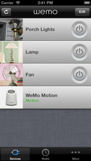 The grey and white colour scheme does allow the odd splash of green to pop form out of the screen, green is an important colour choice based on the environmental nature of the app ( it is also the colour of money in the US of course) However I feel that the choice of grey with this skeumorphic approach only darkens the navigation bar and the interface feels quite claustrophobic.
 I appreciate the icon design within WeMo. The icons for the clock are very easily recognisable and suitably minimalist in approach. The email or SMS icon is also very similar to that of the iOS mail app and therefore fits in well to the operating system's motifs. As i previously mentioned, the green is a good and important touch, there is also an added visual gratification in the applied gradient to the green, giving the colour shape and form. However, the skeumorphic design has also encroached upon this area as the icons have been embellished with drop shadows. I understand the principal of making the icons look more like real buttons by adding depth to the design but I feel it is an unnecessary cluttering of the interface. But perhaps thats just my Bauhaus-ian palette kicking in.
energy saving recommended logo
This is awarded to devices that are deemed to be efficient appliances. Its basic layout and clean colour scheme help it to be both easily recognisable and also relatable to conservation of energy. Also the spherical emblem could also resemble the earth, thus promoting the logo's conservational roots.
The shape may be an issue fitting it into designs that are more grid based as it does not have a conventional form - however - the simplicity and clean lines will help it to remain legible when shrunken down to fit on smaller products.
From this logo the colour scheme and flat design are important to its success.

Saving Money
I've been doing a bit of research into just how much money regularly switching off appliances can save.
Seeing as this is one of the main principles of our app - it was helpful and reassuring to see just how much it can decrease your bill. I got the following information form howstuffworks.com
Firstly I was introduced to this notion of "phantom power" which Beth Brindle describes as;
 "Also called phantom energy, phantom load, standby power, idle current and vampire power, phantom power is the energy used by appliances and electronics when they are turned off but still plugged in to a power outlet [source: Energy Star]. According to the Lawrence Berkeley National Laboratory (LBL), the average home contains 40 products constantly drawing power. Individually, the electricity flowing to a TV that's been turned off or a coffeemaker programmed to brew in the morning is extremely small, but together, these sleeping devices may account for as much as 10 percent of household energy use [source: Lawrence Berkeley National Laboratory]."
From this, its important to infer the amount of energy is being spent on devices that lay idle around the house ` especially as many people now have mobile phones, tablet devices and laptops to power and are often left on charge over night.
But what is the actual economics of all this accumulative phantom power? Brindle continues with;
"According to the Energy Star Web site, the average U.S. household spends more than $100 each year to power devices that are turned off. Nationally, phantom power accounts for more than 100 billion kWh and more than $10 billion in energy costs each year. Now when you think of leaving that VCR plugged in all this time just to display a blinking "12:00" on its digital clock, you probably want to kick yourself."
These figures and concepts really give context to our app, reaffirming its validity and usefulness to the user.
Monday, 18 November 2013
Developing an Energy Saving App
Developing an Energy Saving App
After receiving our Energy Consumption brief we decided to develop a wifi-based central control hub for household energy usage. The app will control usage of the devices through previously installed monitoring devices attached to the appliances and will be able to turn them on and off from a remote location. The app will also be able to monitor household energy usage, paying specific attention to electricity and gas usage.
At their heart, all energy conservation apps are about one thing, saving the users money. Easing global warming and saving the polar ice caps is a nice addition but everyones priority is the conservation of their own bank balance. After a brief look at other energy conscious technology, such as solar panels or wind farms, there seems to be an initial economic investment that then starts to slowly reward the investor - these devices are very much designed to be used for the long run, not a one week fad.
 As well as saving money, eventually, they also reduce usage. This is the second factor we must address in the design of our app. The ability to turn off devices such as showers, heating and electrical outlets, from remote locations will save energy, time and money for the user and the ability to do this all from one central hub will dramatically increase the savings.
 So our app is aimed at an affluent but money conscious demographic, and with the initial installation of the monitoring devices that the app controls it might be wise to aim the app at property developers that install the devices when constructing or renovating buildings.
As you can see from this example of an existing app wifiplug, that controls energy flow to a previously installed electrical outlet plug, most existing designs are skeumorphic and in turn, look dated within the confines of new operating systems like iOS7 and Windows phone. Our design shall be a flat, clean aesthetic that is easy to navigate and function. It shall also work as a central hub that allows the user controls over many devices in one place.
Subscribe to:
Comments (Atom)